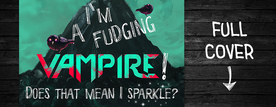
I'm a Fudging Vampire! Cover Reveal
Get The Behind The Scenes Cover Art Process
This book has been relaunched as Bookworm to Badass! If you’d like to see the new cover and my use of AI to improve my covers, click here for that article.
Just want to see the final cover? Click here to jump to it!
Given my abysmal lack of painting skills—I’m working on it!—the way I “paint” is by combining the paintings from others. This is called photobashing. I just happen to use paintings instead of photos.
The artist I use most is Tithi Luadthong, AKA Grandfailure on Deposit Photos, an artist from Thailand. My collection of his work is always growing, currently at 803 paintings. All of my original covers (except for A Shadow in the Darkness) are photobashed from his licensed paintings.
The Messy Canvas . . .
Sometimes, you just have to throw a whole bunch of ideas at the canvas and see what sticks. Since I’m photobashing my covers—or maybe paintbashing, because I use paintings—I’m limited to the images I have.
I use this really awesome app called Eagle to organize thousands of images. I can easily tag them, rate them, write notes, and even filter images by color. The color doesn’t matter a lot since I can change it in Photoshop, but it helps when trying to find a specific image.
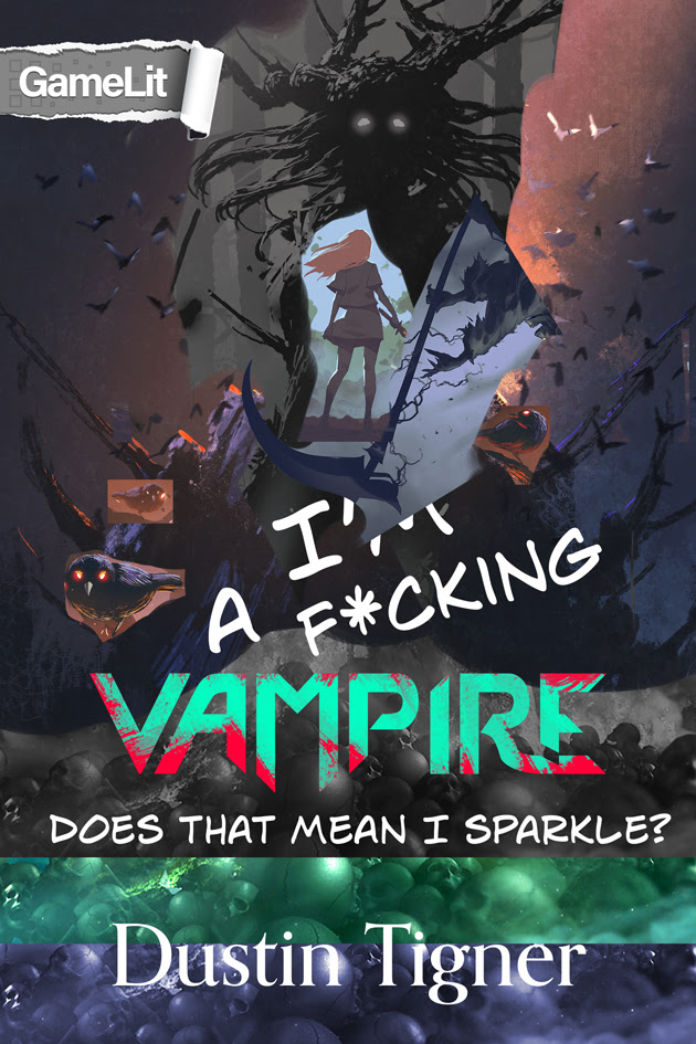
The Mess Gets Messier
Before chucking digital paint on the canvas, I scribble terrible-looking cover ideas onto index cards. Unfortunately, this doesn’t often yield anything usable. Again, I’m limited by the image assets I collect.
The only index-card idea that survived was having Sarah stand with her back to the viewer, holding her totally awesome scythe.
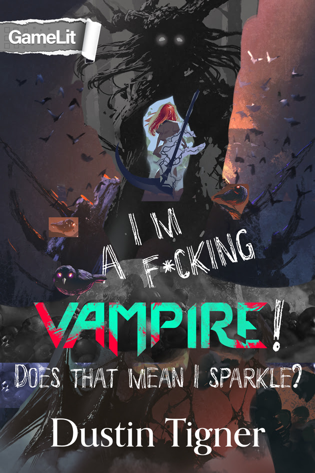
Release the Creative Chaos!
At this point, you’re like, “What’s happening!”
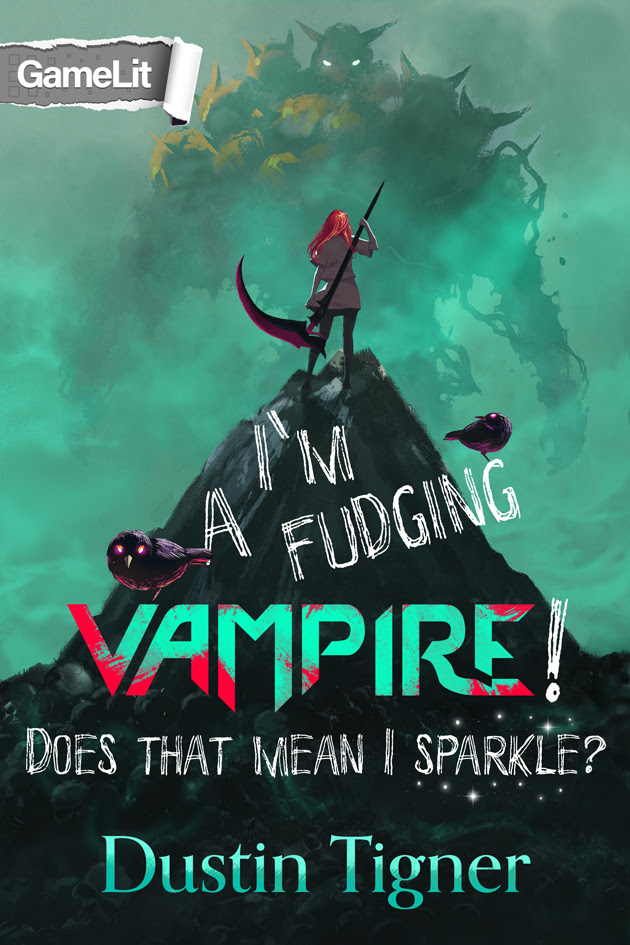
The goal of any cover is to communicate with your ideal audience. A non-sexified version of Sarah holding a crazy scythe communicates that this is a female protagonist story in a fantasy world (and not HaremLit).
Hopefully, the GameLit genre tag conveys that not only is this a fantasy world, it’s a fantasy world with game mechanics. And, with any luck, the big, bold vampire logo will clue people into her being a vampire since that’s kind of hard to show from behind. . . .
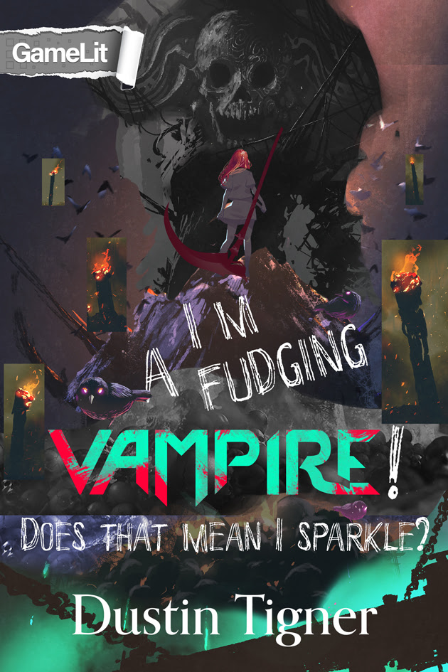
Final Cover
So . . . a few steps were skipped. Sorry. ><
Once I had a good idea of what I wanted—and the assets to make it work—it’s all about cleaning up the idea. It’s vital for the cover to catch readers’ attention in its thumbnail view. That’s hard to do with a whole bunch of competing ideas.
The font I was using didn’t have an apostrophe in I’m. I know, weird. I had to draw that in. I also drew the question mark to make it look more like a question mark. I probably could rough it up a bit more.
Oh! And I painted that arm! The one that’s holding the scythe.
Photobash Assets
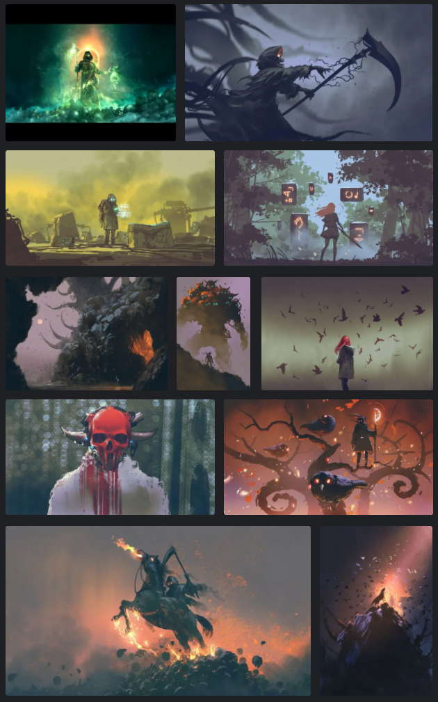
It’s time to look at the original paintings I used to create my cover.
Any of this look familiar? The top left painting is by Mo_Ali, an artist from Egypt. The rest are Grandfailure’s paintings. I used 11 paintings, down from 30.
The second from the top on the left (green science fiction) was used for the main background. And the bottom right painting is what gave me the composition for the entire piece.
Can you find the red skull on the cover? I used that painting 3.5 times. ;)
And that’s a wrap, folks!
I hope you enjoyed seeing how I approach designing a cover. :)
