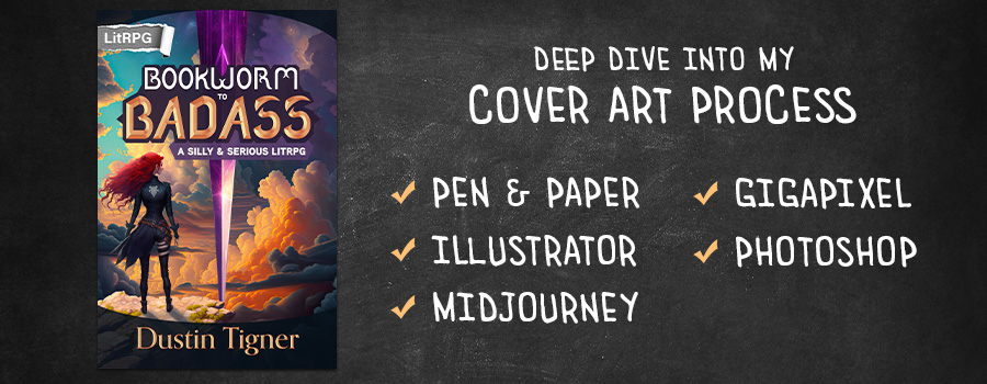
Designing Bookworm to Badass's Cover
Pen & Paper · Adobe Illustrator · Midjourney · Gigapixel · Photoshop
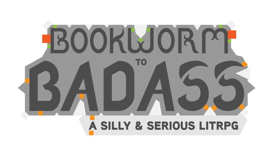
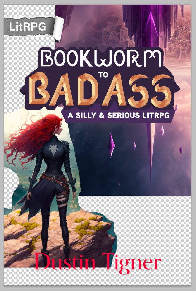
If you are just here to see the cover of Bookworm to Badass in all of its colorful glory, then here you go! Keep scrolling to see how the cover was made.
Also, the book is now available on Amazon and Kindle Unlimited!
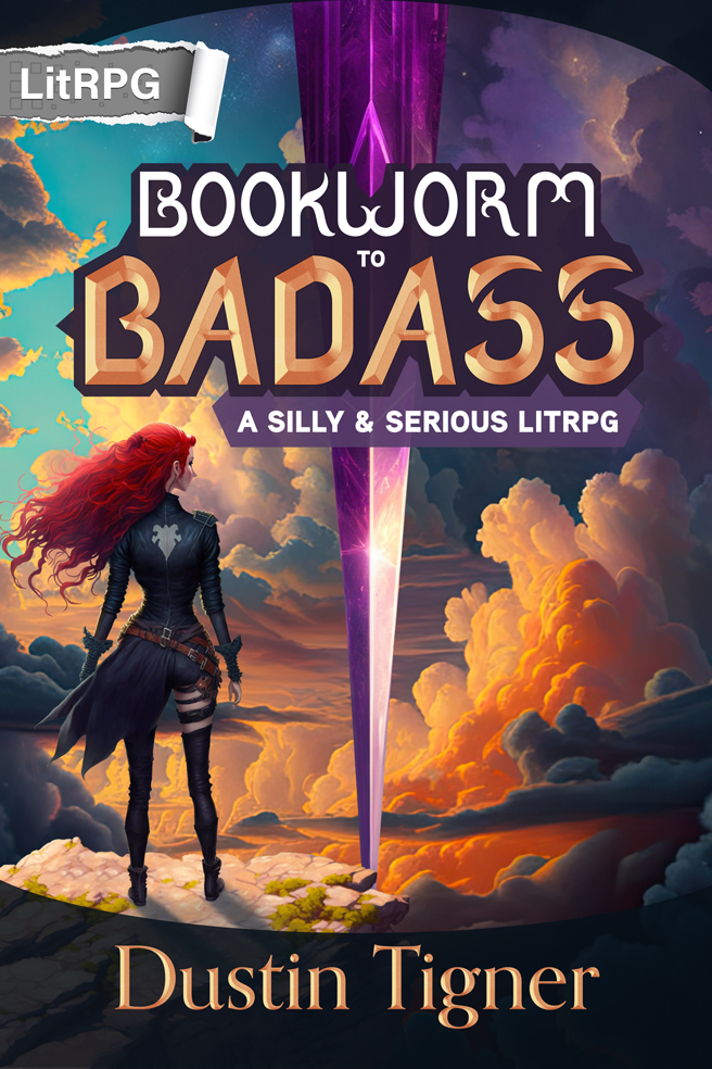
Table of Contents
For your convenience, here are the links to each of the below sections. You might only care about how I used AI art or how I photobash graphical assets. If that’s the case, you won’t hurt my feelings if you skip the boring* stuff.
- Mistakes & Relaunch (A bit long)
- Pen & Paper (Start here for typography)
- Adobe Illustrator
- Midjourney / AI Art (Start here for art)
- Gigapixel & Photo AI
- Photoshop & Polish
- Done! (Start at the end?)
* Boring? My stuff’s not boring!
Mistakes & Relaunch
I think it’s worth starting with some context. Bookworm to Badass was not the original title. And thus, obviously, this is not the original cover.
On December 10th, I launched the book to crickets. Two days later, I pulled the book, sought help, and after many hours, created the above cover that seems to have garnered a lot of interest. Yay!
Turns out, designing an effective cover can be quite challenging. A cover is a single image that must attract the right reader. If the cover fails, the book fails.
View the original cover and design process:
I’m a Fudging Vampire! Does That Mean I Sparkle?
Mistakes
Vampire
When we look at something, we make immediate judgment calls. This is rooted in our survival instincts. And though buying a book is hardly a dangerous endeavor, our brains don’t care. They are data sponges, absorbing, evaluating, organizing, and discarding information constantly.
So when prospective readers see vampire on the cover, the word is associated with preconceived biases. They make assumptions.
But this book is not a vampire book.
Sarah becomes a vampire. True. But it’s a character class. She doesn’t drink blood; she draws essence from others, which works as her mana to trigger skills. She’s immortal, but so is everyone else. And the book is not gothic horror or steamy romance or urban fantasy.
The assumptions readers made were wrong because I included the wrong content on the cover. Worse, readers who wanted a traditional vampire story would likely not be satisfied by this book.
And so, with one simple word, I doomed the book to failure.
The Title
I like long and whimsical titles that I can use to convey the tone. In a way, the title should tell a story. If I’m writing something funny, I want the title to make the reader laugh. If the title can make them laugh, the story will too.
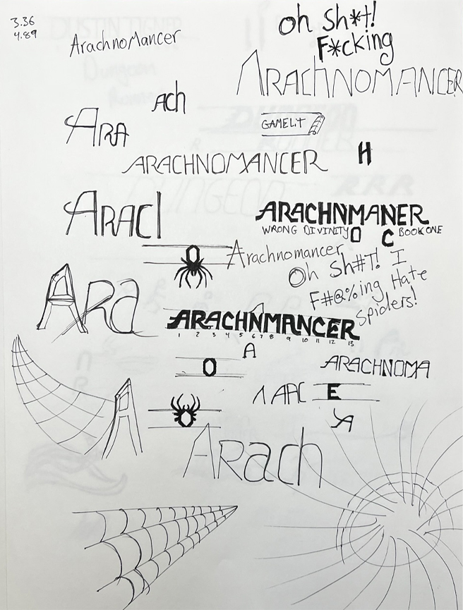
Arachnomaner’s subtitle plays with irony: Oh Sh*t! I F*cking Hate Spiders! And yet, he’s an Arachnomancer. We know what to expect.
I’m a Fudging Vampire! Does That Mean I Sparkle?
This title does everything I want a title to do. We get a sense of the character’s personality, we know she’s a new vampire, and it sets the tone.
But . . .
Yes, there’s always a but.
The title fails in a lot of areas, too.
- The censored F-word targets a younger demographic
- The Twilight joke targets female readers or feels like a parody
- There’s no easy-to-reference title, unlike Arachnomancer
- It’s long, making it more difficult to share with others
Genre Tag
I use GameLit on all of my covers, whether or not LitRPG would be more accurate. I do this because I coined the term and want to represent it whenever I can. But GameLit was never meant to replace LitRPG. The two genres exist for different reasons.
By using GameLit instead of LitRPG as the genre tag, I’m not communicating clearly what the book is about. This is the same problem as using vampire in the title. It sets the wrong expectation.
Bookworm to Badass uses an RPG system with classes, skills, experience, and loot. It is a LitRPG story, through and through.
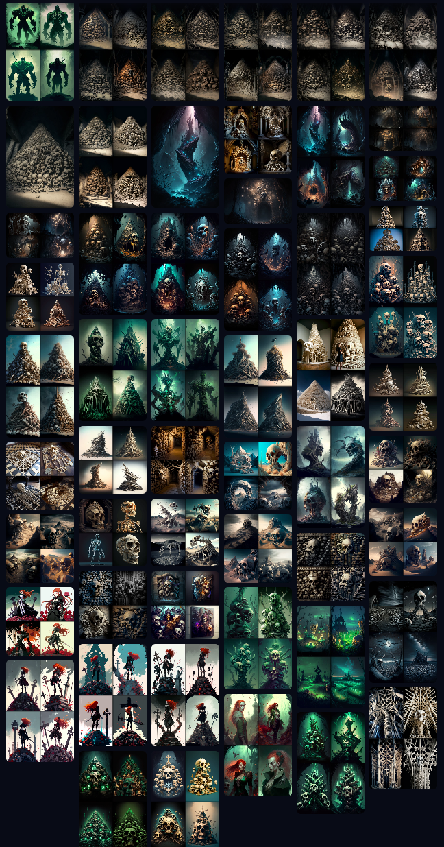
Art Assets
As a photobash artist, I’ve always been limited by the images I have access to. I own over 800 paintings from one artist—Tithi Luadthong—and use them for most of my covers. This helps my covers feel consistent.
I think I’ve done a good job making do with what I’ve had. But my covers have never been top-tier. They might be blurry, cartoonish, lack character diversity or detail, and always force me to compromise my vision in order to get something good enough.
This is evident in the reaction between the two covers. Bookworm to Badass evoked a Wow reaction, which resulted in many more comments, shares, and reactions than the previous cover, which felt ignored. Art quality makes a difference. I’ll talk a bit more about this in the AI art section.
Now, don’t get me wrong, I love Tithi’s art. He has empowered me to create my own covers, which I love doing. But I feel the limitations are starting to get in the way of my success as an author.
Why Does This Matter?
One thousand pages later, you’ve reached the end of the section, and you’re wondering why any of this is important. The answer is that a cover is a lot more than a pretty image.
A cover is marketing. It sets expectations. If you make the wrong decisions—as I did—the book will fail. Bad covers kill books. And beautiful covers that set the wrong expectations kill books.
We need a title that’s easy to reference, looks beautiful on the cover, and conveys a sense of the story. We need eye-catching art that matches the tone, sets the genre, and gets the reader to click. And genre tags need to be accurate to the story, matching tropes and genre conventions readers expect.
Once those things click together, you have a winning cover.
This is what we’ll be created in the next sections.
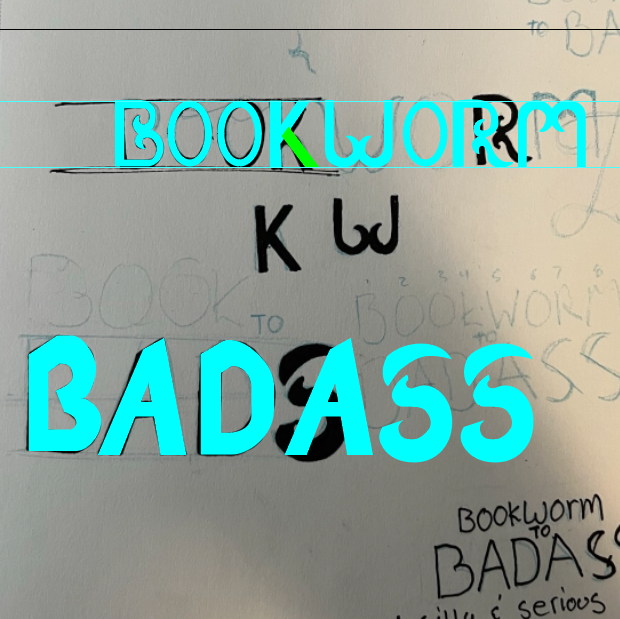
Pen & Paper
Games have logos. I like logos. And so, when I design the typography for a GameLit/LitRPG cover, I think of it as a logo for the story, not just a pretty front.
Logos are designed by hand. You can skip this process, but digital tools can be stifling. I need the freedom to just scribble on the page and see what I can come up with. This allows me to iterate quickly to explore new ideas.
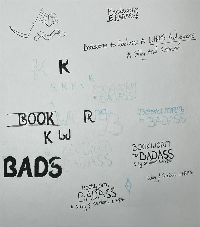
I often start by simply writing the title and jotting down tagline ideas. It’s good to count the letters and figure out how wide and narrow each letter is.
Then starts the questions. Will the words be stacked, left or center or right aligned, script or sans serif or serif? Will the letters be bold or thin? Upper or lowercase? Which word should get the focus?
You can see that I didn’t explore too long before I started drawing the letters, creating interesting shapes, and then inking them. For this logo, I knew that Bookworm would be more artsy and Badass more bold and in your face.
Whether or not anyone pieces this together, I like that the Ss are scythes. It’s a slight design change to the letters, but it makes them look just a bit more unique and noteworthy. Good things to be.
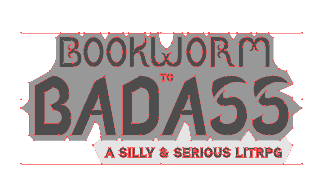
This process isn’t cemented before vectoring the logo. There’s a cyclic approach. I draw letters, ink them, take a picture, then vectorize (see next section). The initial logo had a very plain K that I didn’t love. I later returned to draw the more curvy K above the other inked letters.
Once I’ve inked all the letters I plan to use (skipping duplicates), I take a picture with my phone. There’s no need for anything fancy like a scanner.
Onward to digitizing!
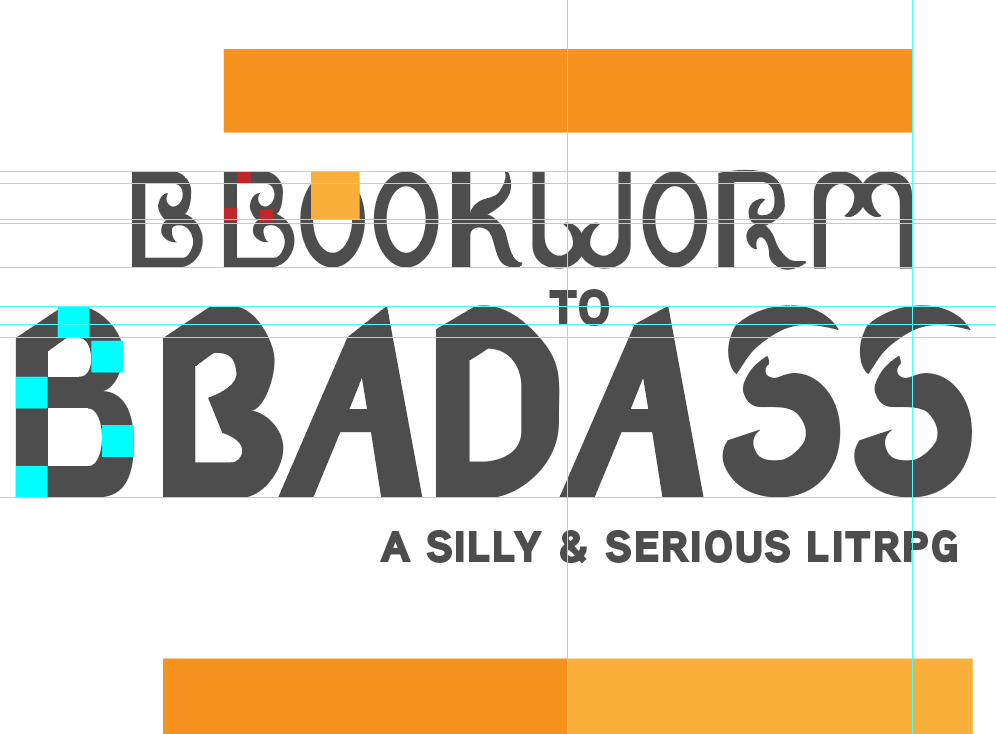
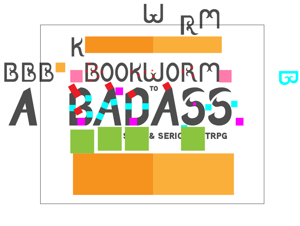
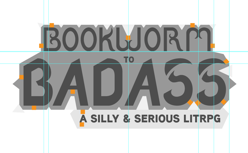
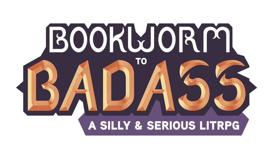
Adobe Illustrator
“Enough words! Show us more pictures!”
Okay okay! I get it. I’m a writer. I like words. But you’re here to see pictures, so I’ll add my comments to their captions.
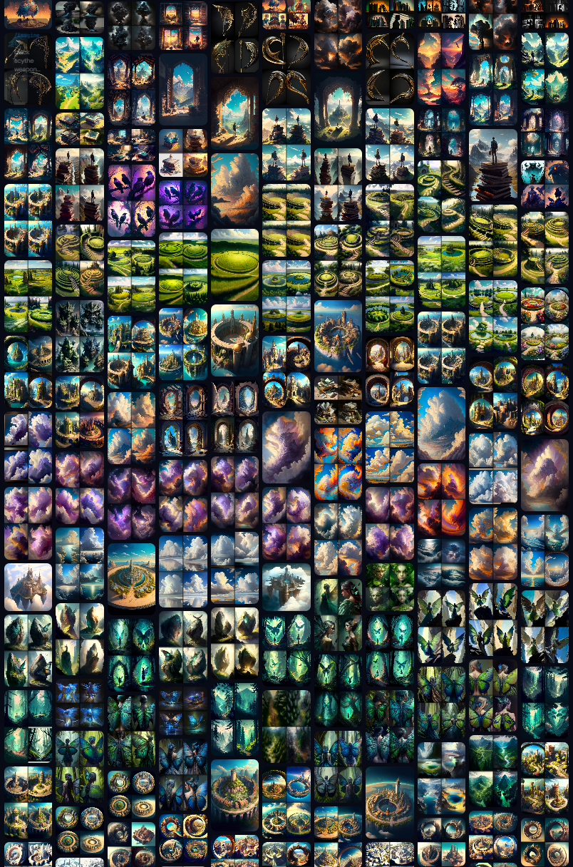
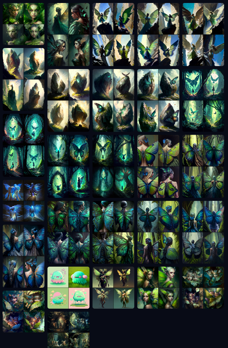
Midjourney / AI Art
I have a lot of thoughts about AI art, ethics, and the future. But this isn’t the article for that. If you hate that I use AI art, I’m sorry you feel that way.
For the last two years, I’ve been vocally against AI while everyone ignored it or played with it. The second I changed my mind, the world decided AI was evil. This is my curse. I can never choose the easy path. . . .
I have listened to both sides extensively. Far more than is healthy. We’re talking about dozens of hours of podcasts, dozens of articles, and countless debates that are ongoing. When I have time, I’ll write a deep-dive article to share my thoughts, which I hope will help alleviate some of the rage.
With that out of the way, let’s look at what it takes to use AI.
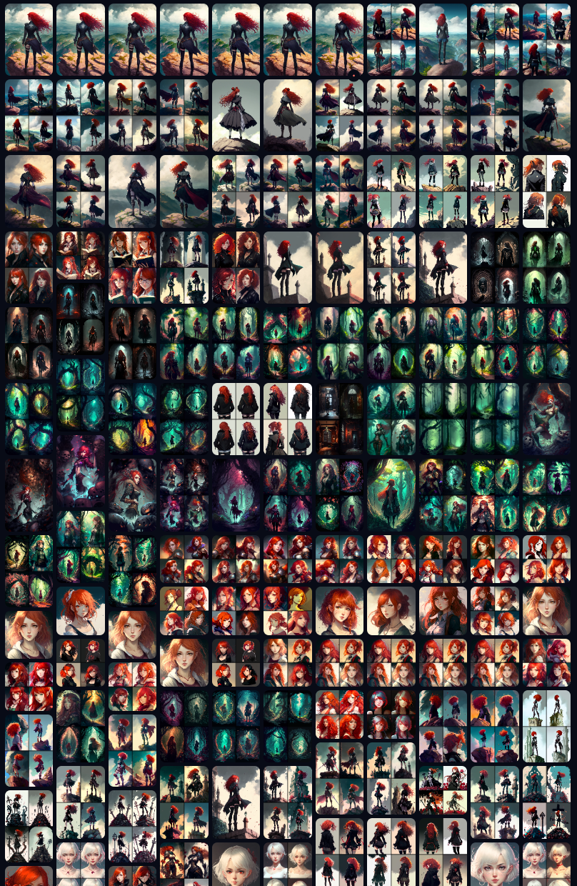
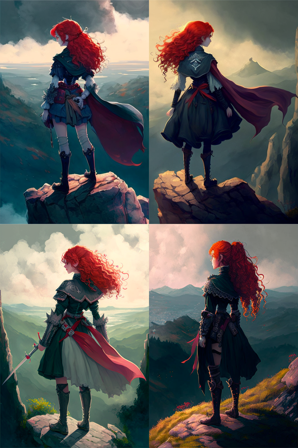
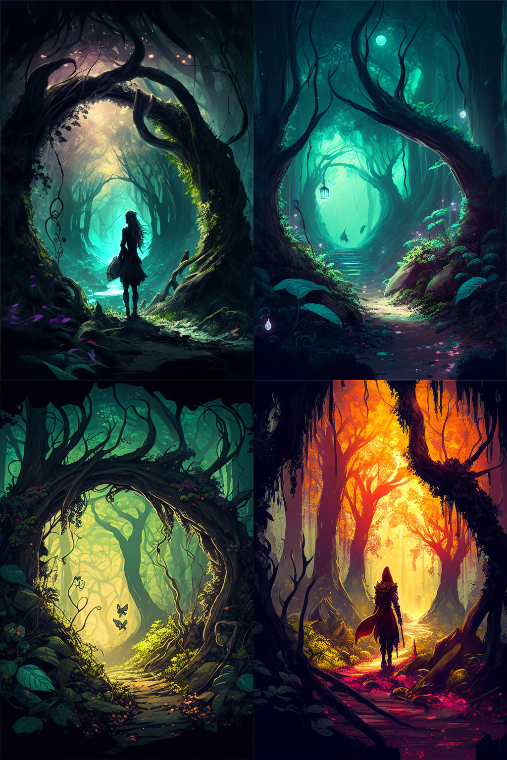
At the time of this writing, I have generated over a thousand images. Most of those images are 2x2, which means I’ve generated four thousand unique images. And yet, the Boomworm to Badass cover only uses four of them.
The art of a photobasher is knowing what to use and what to throw away. This is more true with AI than anything else.
AI art is great at making pretty images. But what is the value of a pretty image that represents nothing or the wrong idea? To use AI with intent takes a lot of work, understanding the system, and patience.
“Shut up! Show us the pictures!”
Gigapixel & Photo AI
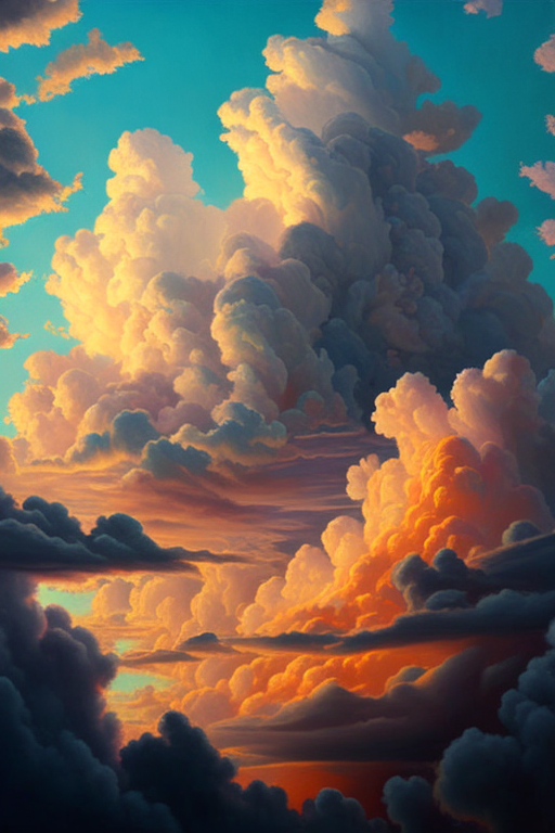
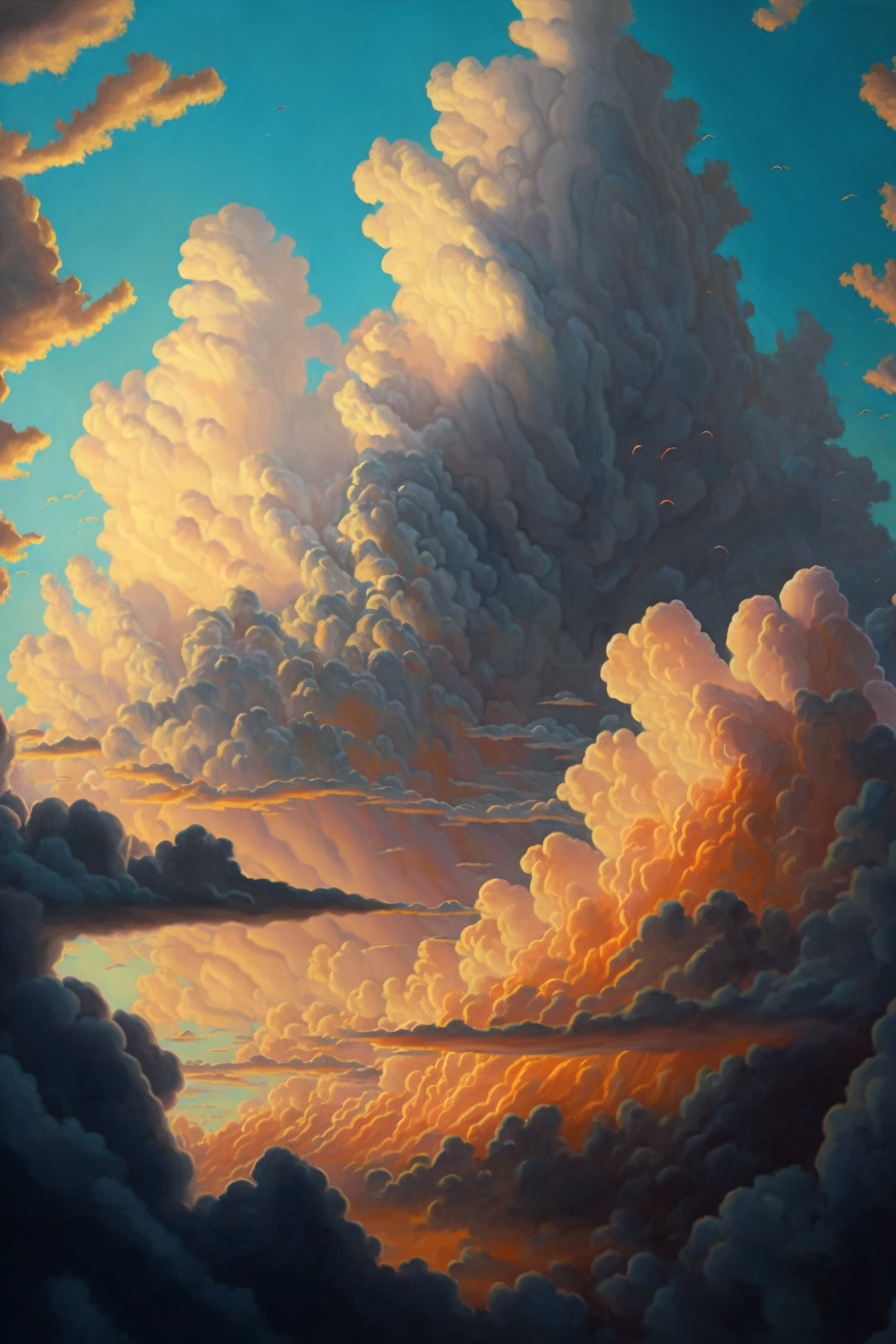
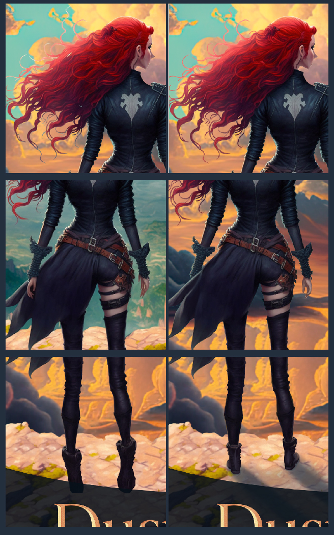
Midjourney can scale images, but it doesn’t work the same way you’d expect. The AI doesn’t simply increase the image’s resolution; it recreates it at a higher resolution, adding extra details.
Unfortunately—at least for now—scaling an image often adds bad details or changes what was good about the original. I show an example of this below.
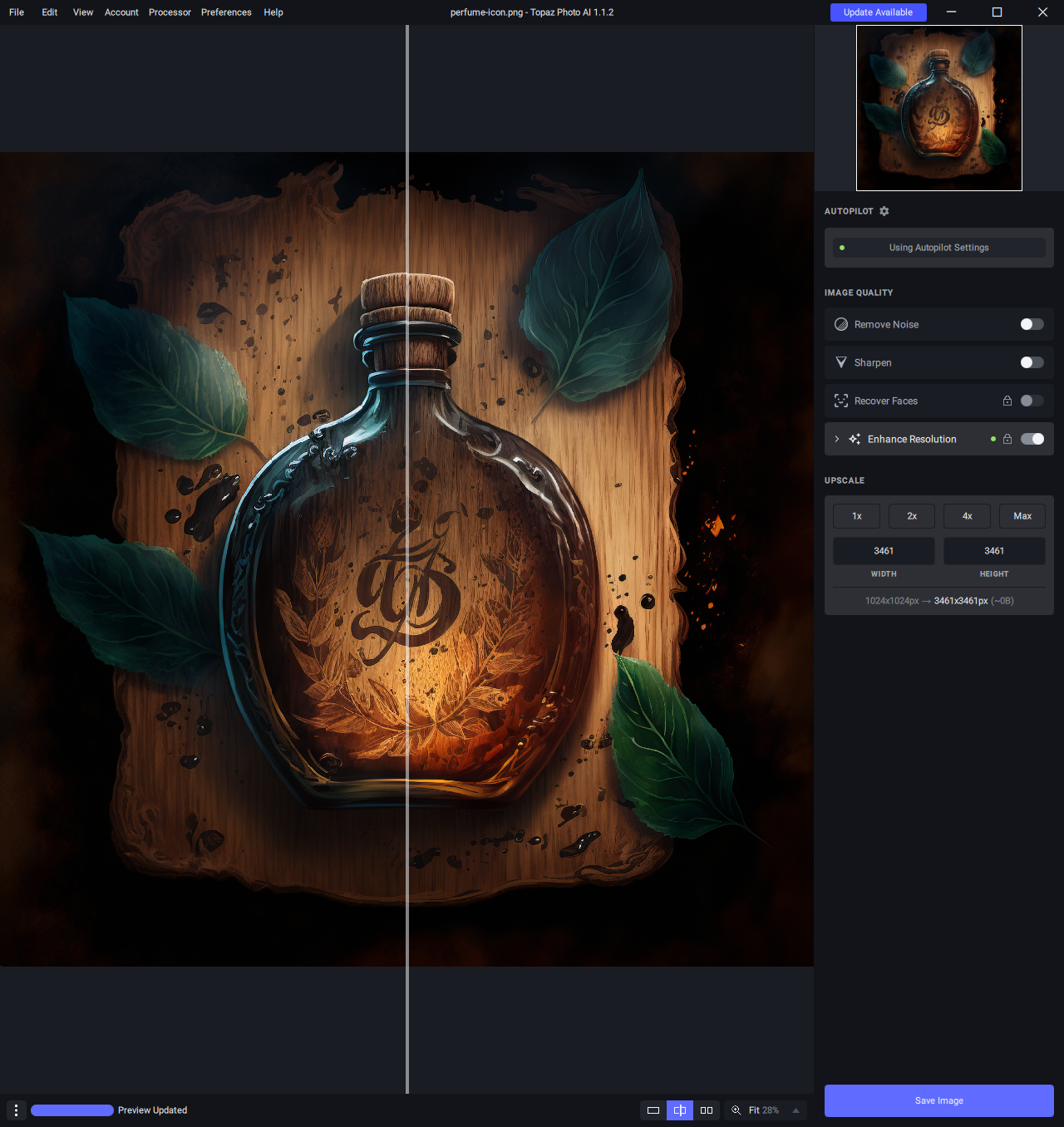
The solution is to use another AI program called Gigapixel to upscale low-resolution images. There are side effects to doing this, but the side effects are better than using a low-resolution image.
Photo AI is from the same company that makes Gigapixel. It handles everything automatically. The two programs often get different results, so if one isn’t providing what I want, I try the other.
Photoshop & Polish
I love to hate on Adobe Photoshop. It’s a buggy mess. I’m forced to use old versions of it just to get it to function correctly. But I’d be lying if I said it wasn’t a vital tool to my cover design process. To be fair, I probably push the software harder than most people.
If you are looking for a cost-effective alternative, you should check out Affinity. I’ve used Adobe products for twenty years now, so changing is hard. But you’re not me! You can save hundreds of dollars a year by using Affinity. (This is not a car insurance ad.)
So this—Photoshop—is where the magic happens. This is where I cut out and combine images, paint over images, apply effects, and everything else required to create the final piece.
Yes yes, I know. Stop talking and show the images. Here we go!
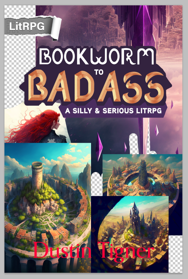
Just a quick note on how hard it is to get something this precise from an AI. I needed the right type of architecture, in a circle with a hollow middle, seen from afar, at the right perspective angle, and in the right style. I got close a few times but ultimately decided it added too many details to the cover.
Done!
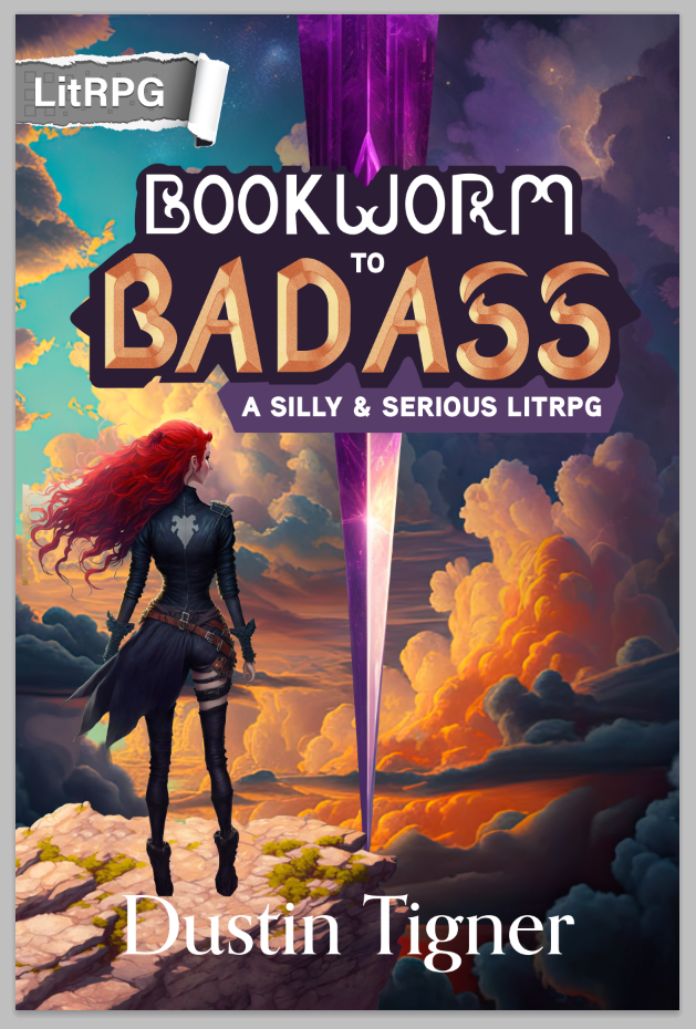
Here’s the cover again, so you don’t have to scroll all the way up to the top.
As you can see, a lot of work goes into making a decent cover. And it’s not just the illustration. There are so many variables we need to consider when marketing a new book to prospective readers.
People judge books by their covers. And they are perfectly justified in doing so. It’s my job as an author and creative to create something that entices readers. Failure is just an opportunity to learn and grow. We make our success by being persistent.
I hope this article was helpful or interesting!
If Bookworm to Badass sounds like a book you’d enjoy, grab it here!
Thanks for reading. Stay creative. :)